Comparing Onyx Boox Note Air vs Boox Note2
- Source: blog.the-ebook-reader.com
- Author: Nathan, 09.23.2020
- All rights reserved

Now that Onyx has released the new 10.3-inch Note Air, I thought it would be interesting to see how it compares to the Onyx Note2.
Update: See this newer post for an updated comparison with a video review: Comparison of Onyx Boox Note Air, Note3 and Note2.
Usually when Onyx releases a new model it’s an upgrade over the previous model, but this time around the Note Air is more of a spinoff device with a new design. Some of the features are upgraded but others are a clear downgrade.
My biggest concern with the Note Air is it’s using a glass-backed E Ink Carta screen, whereas the Note2 has a flexible E Ink Mobius screen. A glass-backed screen is going to be more susceptible to breaking than a flexible screen, and glass-based E Ink screens are notorious for being fragile.
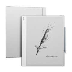
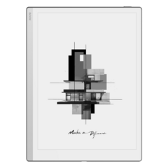
The main difference with the Note Air is the new offset design with one side being larger than the other to give it a handle of sorts, and they added a rotation sensor so the screen will automatically rotate depending on how you hold it. While it’s a shameless copy of the Remarkable 2, the asymmetrical design can make it more comfortable to hold, but then again I’ve never found the Note2 difficult to hold.
The one thing I don’t like about the design of the Note Air is the lack of buttons. Navigating Android without a back button can be painfully awkward at times, but at least Onyx does have the NavBall for an onscreen back button.
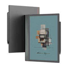
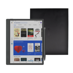
Another change with the Note Air is it has an aluminum case and it comes with a magnetic stylus that attaches to the side of the case.
Another weird detail mentioned on Onyx’s Note Air announcement page is the fact that the Note Air has dual batteries. I don’t know what the advantage of that is, but the overall capacity is much lower than the Note2.
It’s funny how Onyx is marketing the Note Air as the “thinnest 10.3-inch E Ink tablet with frontlight”. They have to fit the “frontlight” stipulation in there because the Remarkable 2 is in fact 1.1mm thinner, but it lacks a light. I don’t know why these companies think having a thinner device is a key selling point anyway. When is the last time you heard someone complaining about a reading device being too thick?
I still can’t figure out the name considering the fact the Note Air is the heaviest “Note” model that Onyx has released. It goes to show how much heavier glass-backed screens are than flexible Mobius screens. The Note2 weighs 40 grams less even though it has a much larger battery.
Note Air vs Note2 Comparison Table
| Specs List | Note Air | Note2 |
|---|---|---|
| Screen | 10.3″ HD Carta Screen | 10.3″ Flexible Mobius Screen |
| Resolution | 1872×1404 Carta (227dpi) | 1872×1404 (227dpi) |
| Frontlight | Yes, with adjustable color temp | Yes, with adjustable color temp |
| CPU | “Upgraded” Octa-core | Octa-core 2.0GHz |
| RAM | 3GB (LPDDR4X) | 4GB (LPDDR3) |
| Storage | 32GB | 64GB |
| Battery | 3000mAh | 4300mAh |
| Wireless | BT5.0, WiFi 2.4G+5G | BT4.1, WiFi 2.4G+5G |
| OS | Android 10 | Android 9 |
| USB | USB-C, OTG Support | USB-C, OTG Support |
| Sensors | Rotation | Fingerprint |
| Speakers | 1 Speaker | 2 Speakers |
| Weight | 420 grams | 380 grams |
| Size | 229.4 x 195.4 x 5.8mm | 249.5 x 177.8 x 7.1mm |
| Price | $479 | $549 |


_announce_600x600-240x240.png)
